Disclaimer: This is a school project. All materials, including final product mockups, are fictitious and HAVE no association with the real client.
TYPE
Brand Identity, Marketing, Campaign Design
DATE
Sep – Nov 2019
ROLES
Lead Designer, Illustrator
DELIVERABLES
2 Web banners, 2 Print posters, 1 Outdoor sign, Facebook Cover Image
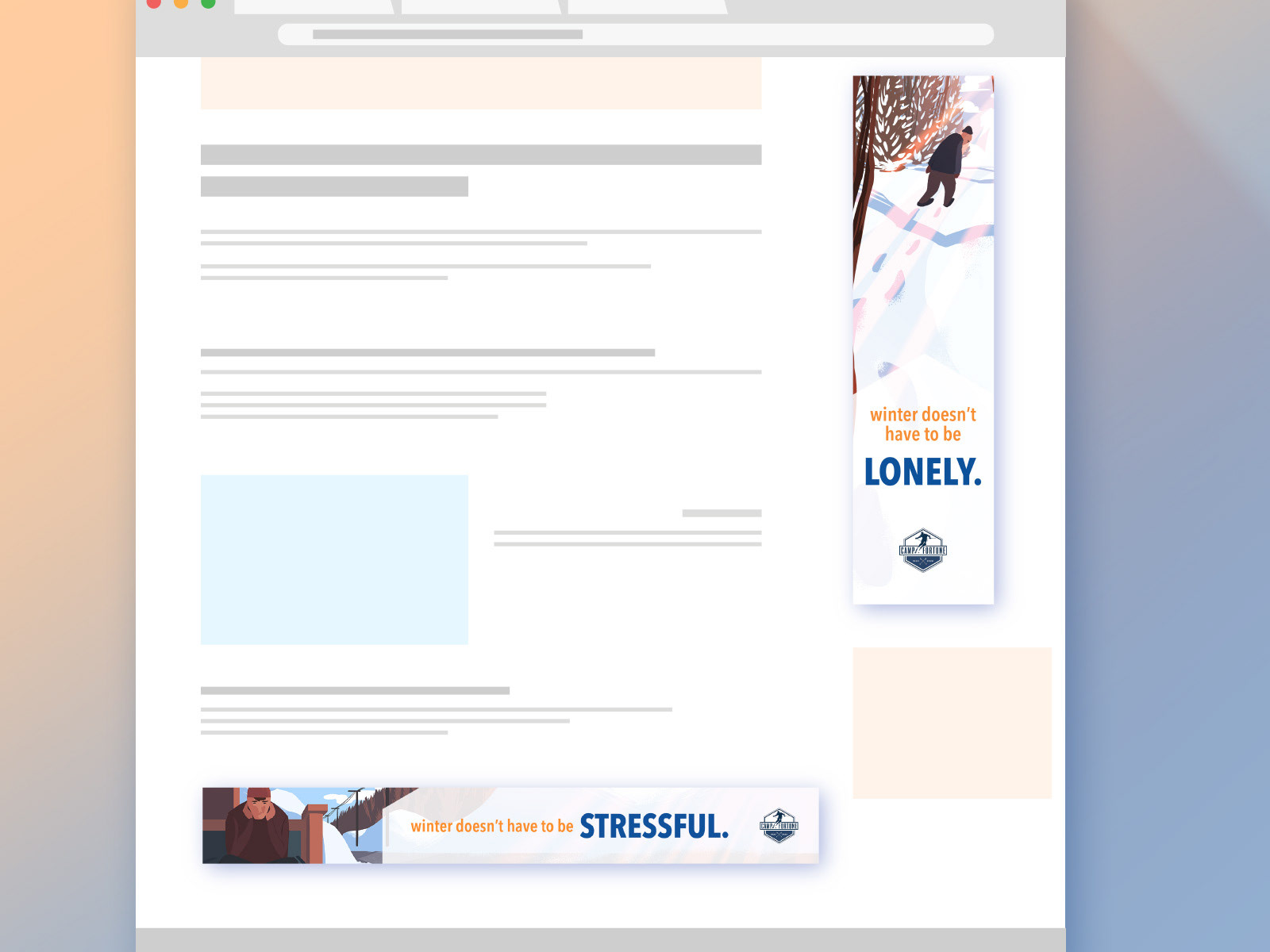
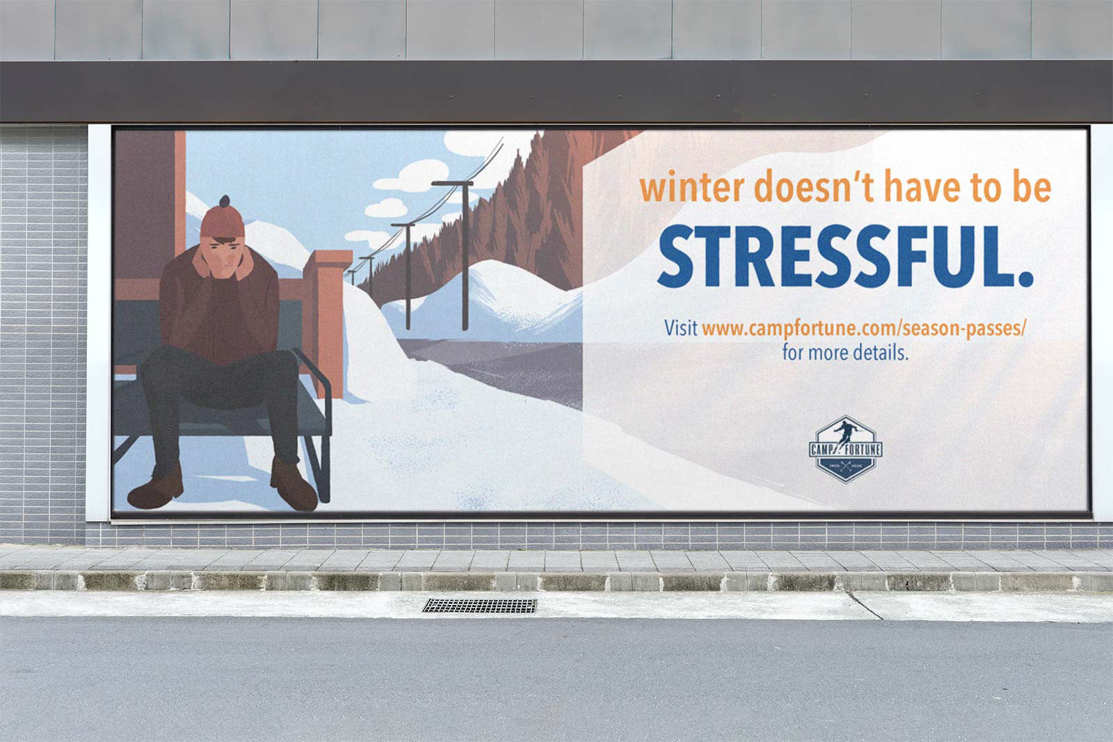
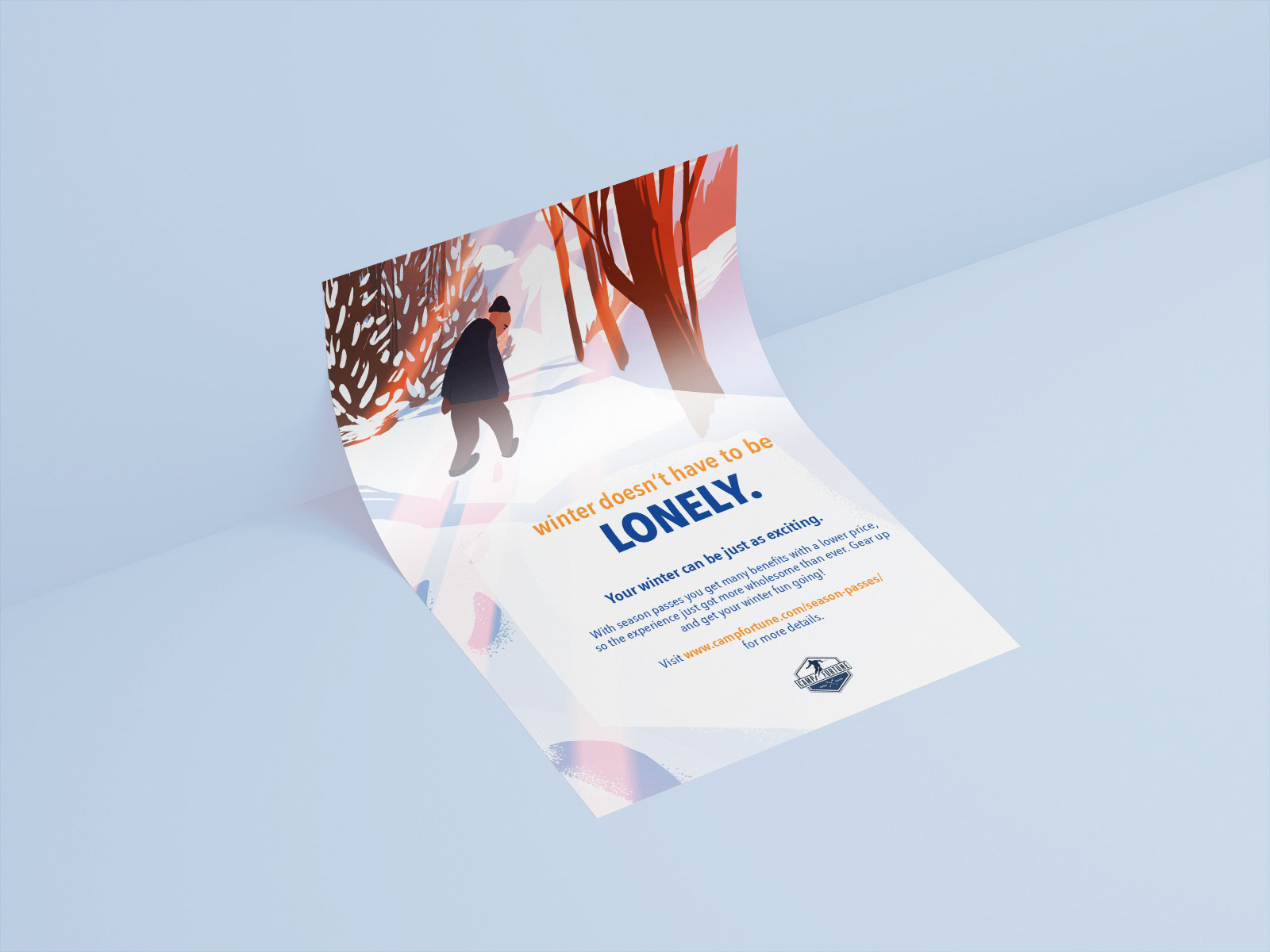
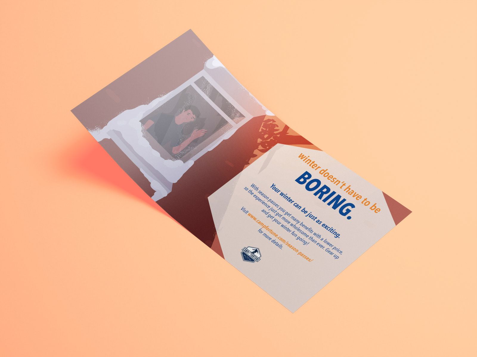
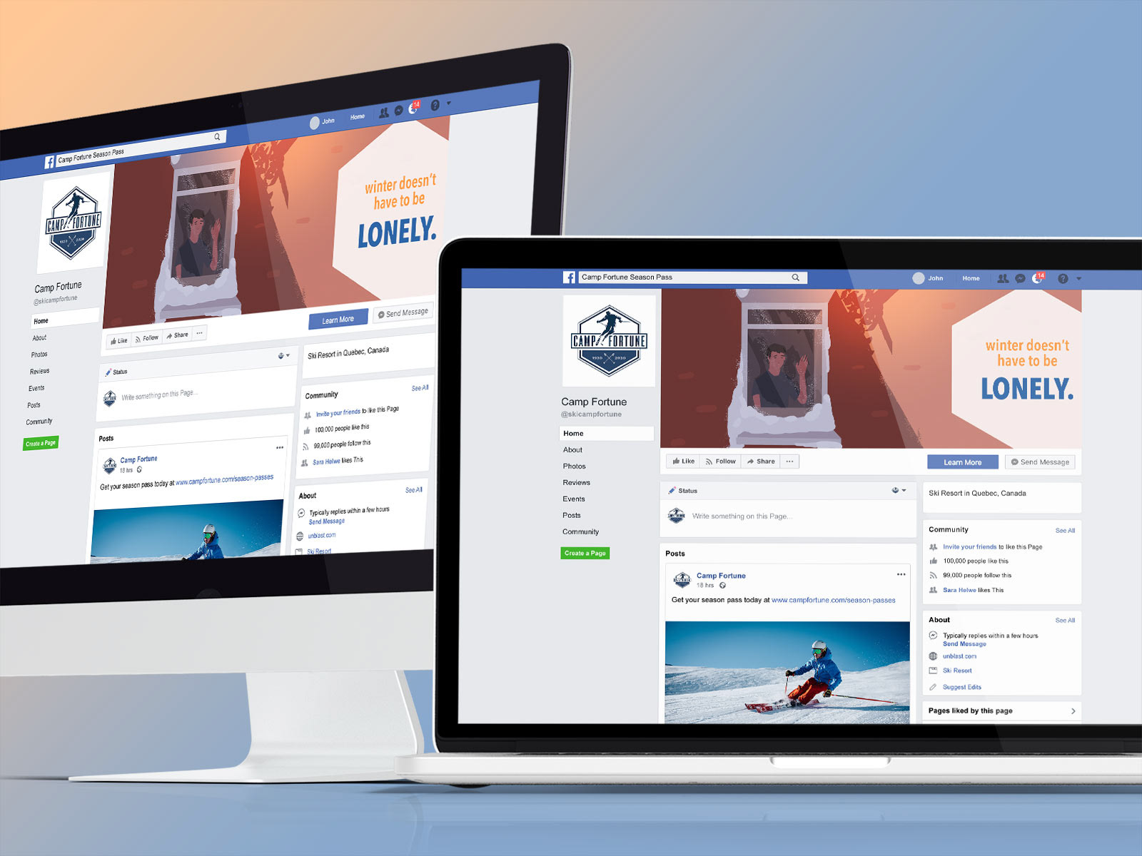
Camp Fortune, a ski resort located just 15 minutes away from Ottawa, is known for its beautiful ski hills in the winter and spectacular hiking trails in the summer. Before the beginning of winter and the opening of skiing services, Camp Fortune wanted to promote their season passes, so I thought a complete campaign design with both digital and print deliverables would be the perfect marketing tool.
Preparation
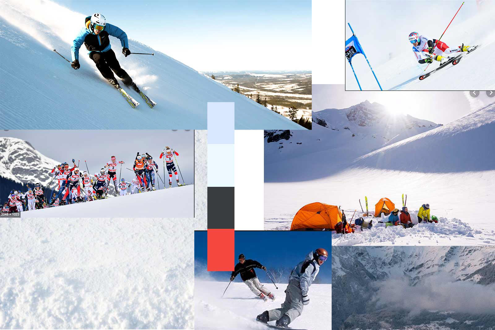
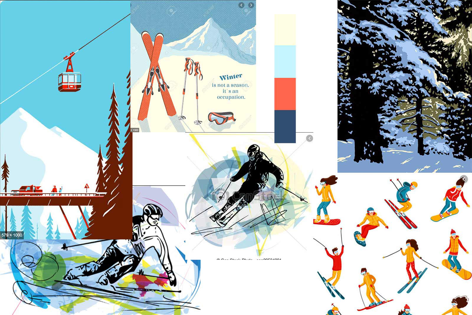
Visual Identity
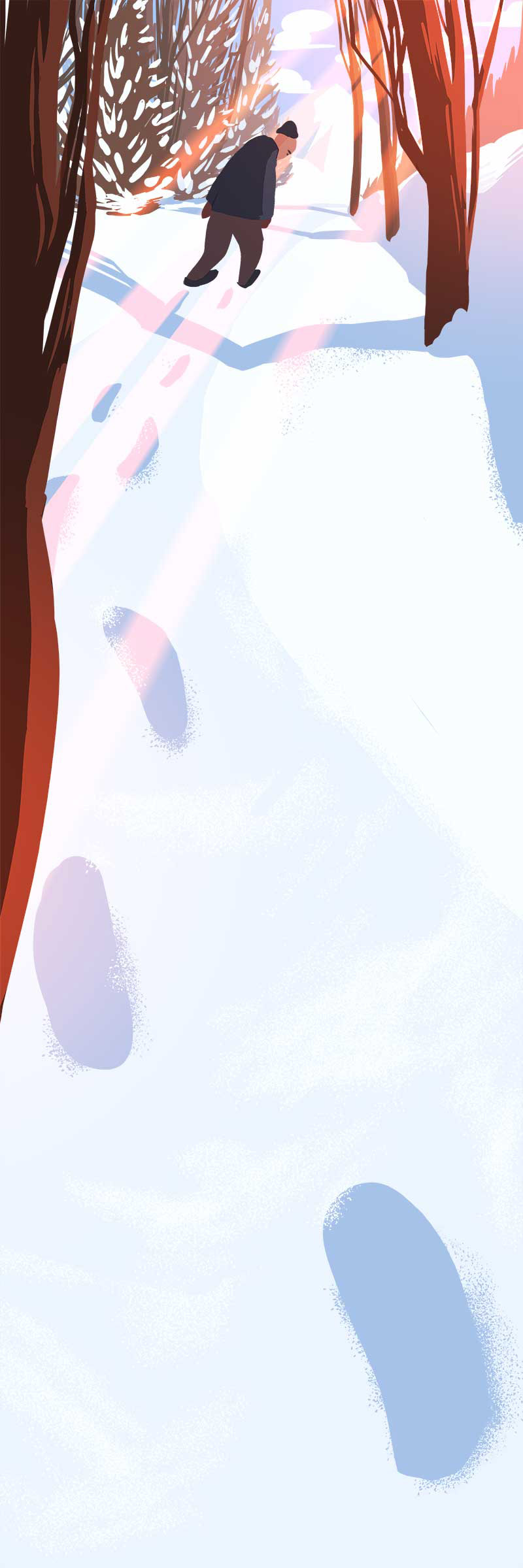
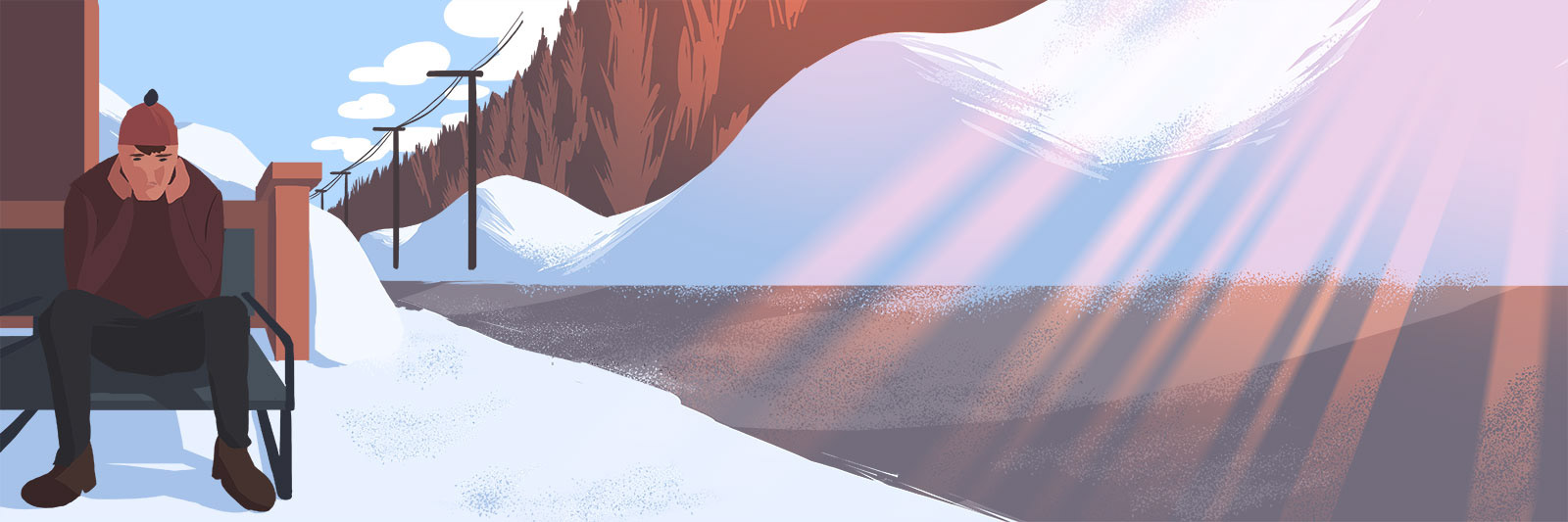
My goal is to address the target audience — that is — ski enthusiasts of all ages; to achieve this, I came up with the solution of using bright, fun and friendly illustrations accompanied by lively and bold text.
Marketing Messages
Since the product Camp Fortune selling is winter season passes, the key messages will situate around the idea of seasonal outdoor activities. This time of the year is known for its gloominess and seclusion that often leads to extended boredom and frustration; thus, I decided to come up with strong marketing messages that directly tackles these ill feelings:
Winter doesn't have to be lonely.
Winter doesn't have to be stressful.
Winter doesn't have to be boring.
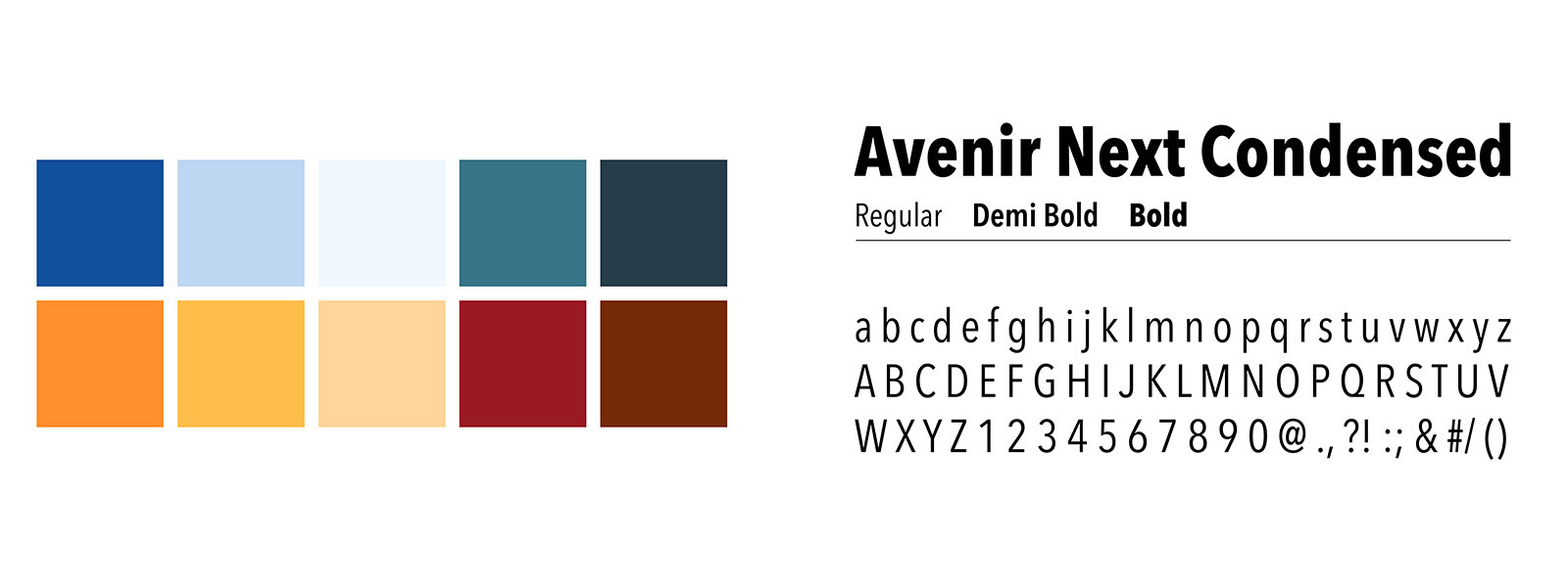
Colours & typography
Finalized Designs
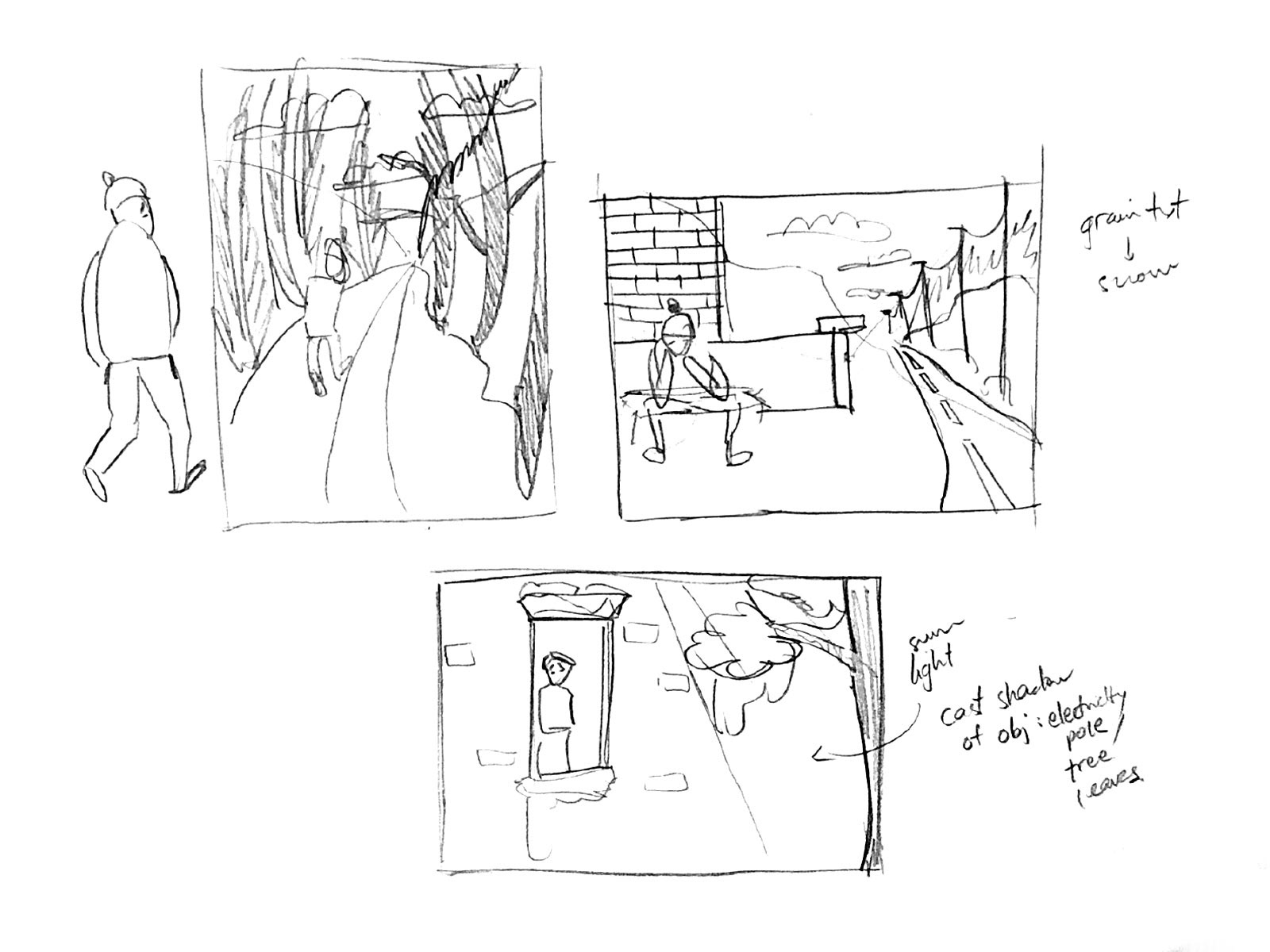
Illustrations
These three finalized illustrations were painted digitally in pairs with three previously-defined marketing messages. I chose to go with a clean art style with no outline to strengthen the tone of voice of the company. I wanted the overall look and feel to be fun, family-friendly and exciting; therefore, I illustrated them in a way that is welcoming towards customers with a variety of backgrounds. Also, I paid close attention to character placement and overall composition and made sure to create enough space and to complement type elements.

click to view at full size